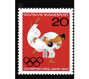
Olympic Summer Games - Germany / Federal Republic of Germany 1964 - 20
Theme: Post & Philately
| Country | Germany / Federal Republic of Germany |
| Issue Date | 1964 |
| Face Value | 20.00 |
| Color | red |
| Perforation | K 13 3/4: 14 |
| Printing Type | 4-color offset printing |
| Stamp Type | Postage stamp |
| Item Type | Stamp |
| Chronological Issue Number | 341 |
| Chronological Chapter | GER-BRD |
| SID | 376447 |
| In 72 Wishlists | |
For the Olympic Year 1964, the German Federal Post Office issued a special postage stamp. The Olympic idea is spread all over the world, the essence of the Olympic Games is well known and familiar. Therefore, it was not possible to give the artists invited for the drafting of the work pictures or to give specific instructions. After a first call for proposals, in which the participants were completely free to decide which motive they wanted to use, Eduard J. Sauer made five suggestions, while Prof. Walter Breker, Bert Jäger and Walther Bergmann each provided a draft. The graphic designers Rüdiger Halt and Karl Heinz Grindler proposed by the German Olympic Committee presented four and three solutions. It is true that some of Eduard J. Sauer's works boast considerable graphic appeal and a close intellectual relationship to the subject, namely those designs in which the middle one of the Olympic rings is made into the sun ball of the Japanese flag. Executed in two-tone intaglio, this fruitful idea would have become obvious. However, despite the quality of these proposals, the Art Council was unable to reach a positive decision because it felt the brand should express something of the real Olympic event. To prepare for a sure result, two more tenders were conducted in two different directions. One group of graphic artists was again free to choose the topic, another group was induced to use the transferred images to evaluate the peculiarity of Tokyo's Olympic buildings as a memorable brand motif. In the first group, Jo Lindinger and Hans Schweiß each delivered two designs, Andreas Brylka and graphic designer couple Dorothea and Fritz Fischer-Nosbisch three each, and Wilfried Blecher six designs. The second group received three proposals from Hermann Bentele, two from Gerta Haller, Karl Oskar Blase and Nikolaus Müller, and three from Professor Eduard Ege. The most useful solution to this second and third call for tenders was the group of figures taken from an ancient Greek vase and placed in the red sun circle. But this proposal of Dorothea and Fritz Fischer-Nosbisch also seemed too general to convince to the last. After detailed discussions with representatives of the German Olympic Committee, it was decided to demand in a fourth call for tenders that a combat phase from the judo sport be presented, which comes from Japan and is admitted for the first time as a sporting discipline at the Olympic Games in Tokyo. The invited graphic artists were sent suitable photographs. Walther Bergmann made a proposal. Heinz and Hella Schillinger delivered two, Gerd and Erika Aretz three and Reinhart Heinsdorff seven designs. The graphic designer Werner Kitz, who was named by sports enthusiasts, participated in this tender with three solutions. The test of the new proposals showed that the effort and perseverance had paid off. The design of the graphic artists Heinz and Hella Schillinger proposed by the Art Council and endorsed by the Federal Minister of Posts and Telecommunications represents an artistic optimum. The brand breathes something of the spirit of the host country, in whose capital the 1964 Olympic Games take place. In her colourfulness she is reminiscent of the old Japanese art of lacquer painting. Bundesdruckerei Berlin has provided for the execution in four-color offset printing.


