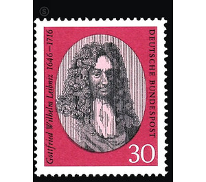
250th anniversary of death of Gottfried Wilhelm Leibniz - Germany / Federal Republic of Germany 1966 - 30 Pfennig
Theme: Calender
| Country | Germany / Federal Republic of Germany |
| Issue Date | 1966 |
| Face Value | 30.00 |
| Color | grey red |
| Perforation | K 14 |
| Printing Type | 2-color offset printing and Typography |
| Stamp Type | Postage stamp |
| Item Type | Stamp |
| Chronological Issue Number | 408 |
| Chronological Chapter | GER-BRD |
| SID | 60312 |
| In 62 Wishlists | |
Gottfried Wilhelm Leibniz, one of the last great scholar figures of universal rank, who produced humanity, was born on July 1, 1646 in Leipzig and died on November 14, 1716 in Hanover. Because his death anniversary marks the 250th anniversary of his death, this commemorative stamp is dedicated to him. After a call for tenders among four graphic artists who had been given a contemporary portrait engraving as support, Prof. Karl Oskar Blase received a proposal in various color variations, while Herbert Kern and Horst A. Rischka each sent two drafts and Hans Peter Willberg with three involved in various solutions. All efforts were obviously countered by the feature-cut and lit by a waking mind facial features that give the important face the noble form, and the costume of the time, which finds its beautiful representative expression in the splendidly flowing wig. No wonder then, that the participating artists proliferated with these pounds and came to good solutions. Surprising are the manifold possibilities that Hans Peter Willberg points out in order to limit the image embedded in the abundant hair in ever new clippings and to incorporate them into the brand area. In the free field parts, which then remain, the font fits in as an integral part of the brand and preserves its very special weight as an ornamental element. But there is another suggestion that the attention of the evaluating observer can not ignore. Prof. Karl Oskar Blase succeeds in fulfilling his work with a mood that mirrors the turn of the 17th and 18th centuries with seemingly conventional means. The portraits set into the slimmer or stouter oval, which are formed with graceful gravers as a graceful interplay of lines, are to be found in numerous numbers in that epoch. But only when you look closely reveals that the drawing of the mark in their delicate transitions from the brightest tone on different shades of gray to deep blacks is not added in the traditional sense, but that a strict, consisting only of vertical lines of various strengths grid system generates the image , Even the elegant curls of the hair curls are not drawn, but they turn out to be brightnesses left out of this line network. This capricious design, which was inspired by thoroughly modern ideas, has convinced so much that it had to be given preference over all others. The Federal Minister of Posts and Telecommunications has accepted the proposal of the Art Advisory Board and determined that this mark is executed. It has been realized in the Bundesdruckerei Berlin in such a way that on a run in two-tone offset printing substrate the portrait and the font are in intaglio. The surface of the oval is filled with a bright red, which stands well in the rich red of the passe-partout-like framing. The engraved drawing is printed in a black strongly brightened to gray.


